I think I made a mistake.
At the start of the last generation of gaming, I was a huge proponent of the PlayStation 4. As someone who had both a launch PS4 and Xbox One, the user experience was night and day. PS4’s UI was fluid and felt a lot more polished overall even if it was missing some killer features like a quick menu (how?!) while my Xbox chugged after my first boot up. Even after running updates and letting it “settle” the Xbox felt like it couldn’t keep up—and I haven’t even mentioned the laughable need for Kinect or the clunky features like Snap.
But like I wrote in a previous post, a lot changed in the eight years since both consoles launched and I found myself fanboying over what Team Green and Phil did to transform the Xbox experience. It was so well done, in fact, that I didn’t touch my PS4 for about a year. If there was a third party game I wanted, I bought it on Xbox instead.
Fast forward to the reveal of the Xbox Series X and PlayStation 5 and it was pretty much set in stone that Series X was going to be my primary console of choice with the idea that I might eventually get the other console at a later date, even though I’m trying to not have every system since I don’t need them (LOL, I know). I’m not sure why, but something compelled me to flip and go with PS5 instead. I think nostalgia got a hold of me and clouded my judgement and let me tell you: the fifth generation of PlayStation has been the most disappointing and frustrating out of all of them for me so far, and I really wish I went with the Series X like I originally planned. Let me break down why.
A Disjointed User Interface
Sony and Microsoft couldn’t have taken more opposite approaches to their UI choice moving into the next generation. As is tradition, Sony decided to create a whole new UI while Microsoft chose to refine and tweak the Xbox Dashboard on over a period of years and carry it over to the Series X|S. Having a new UI to dive into appealed to me, but the overall changes are only skin deep. The settings and submenu on PS5 are largely the same as they were on PS4, except the PS5 menu feels more disconnected from the overall experience.
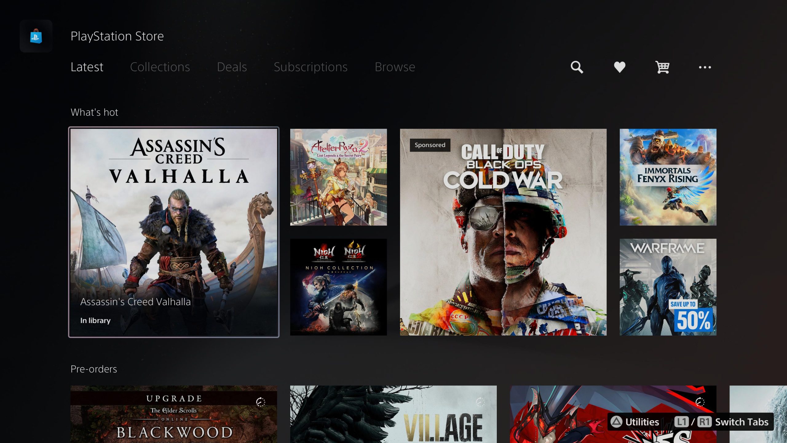
To Sony’s credit, the company managed to reorganize the settings menu so it’s not as daunting as it once was (something I feel like Apple needs to work on with iOS and iPadOS). On PS4 the main theme was blue with white text and UI elements that carried over into all the other menus and submenus. Even the PlayStation Store kept this general design aesthetic. This gave the overall user experience a sense of cohesiveness, that is, until a user picked a different theme—many of which I found gaudy, but to each their own.
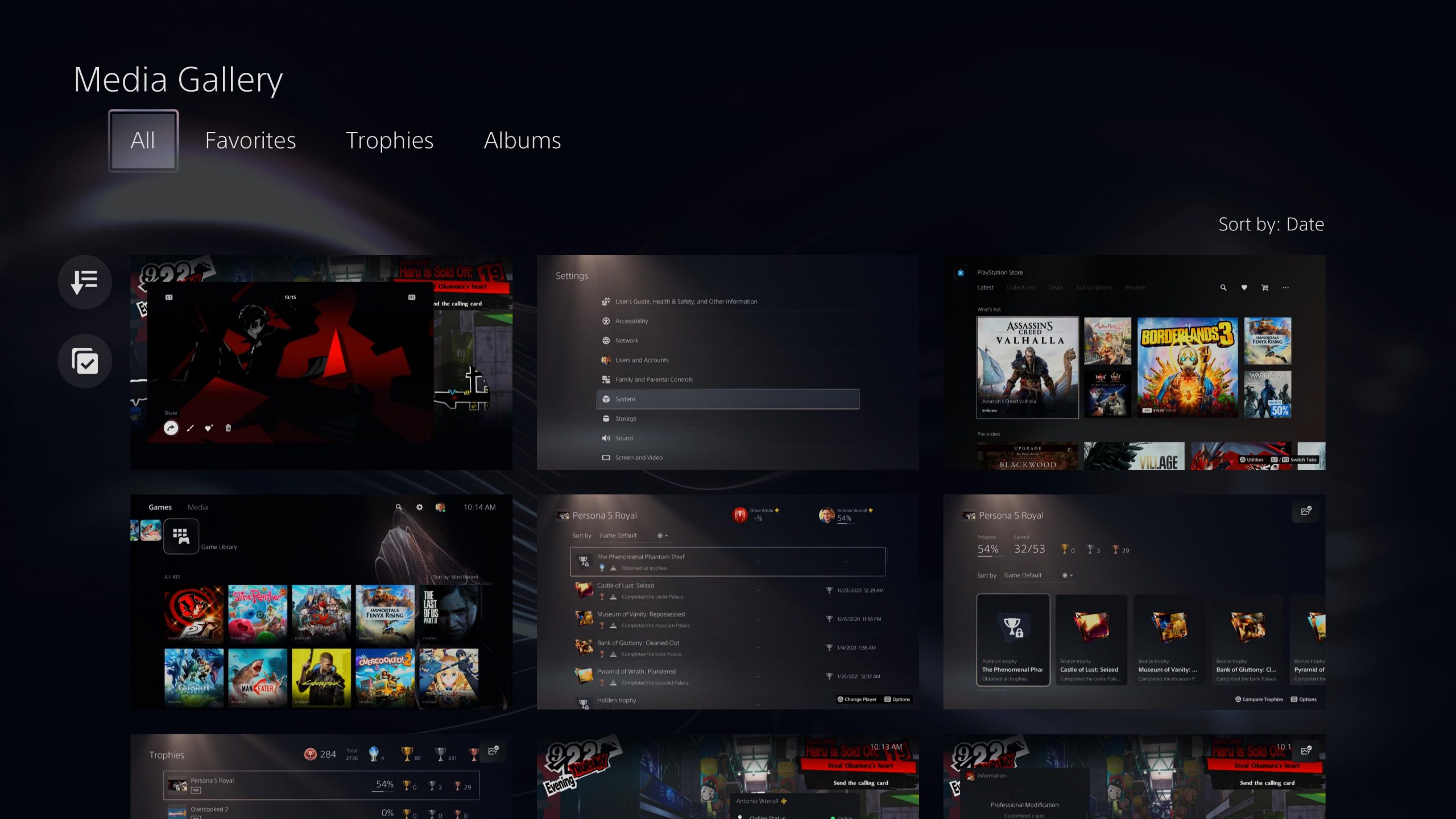
The Media Library
The Game Library
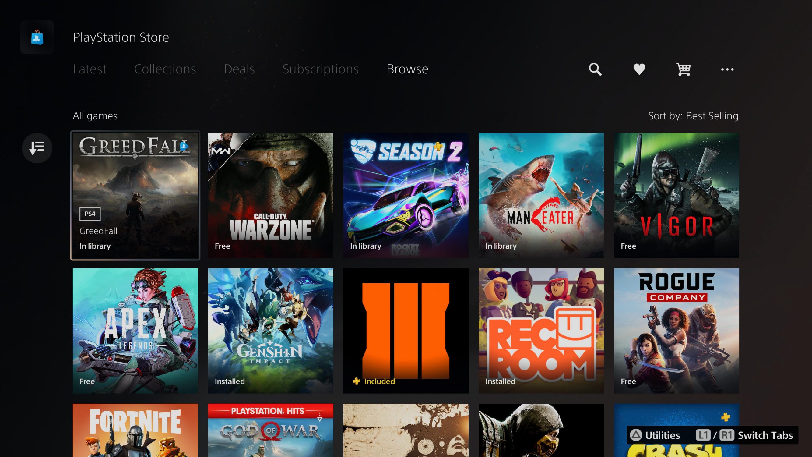
The PSN Store
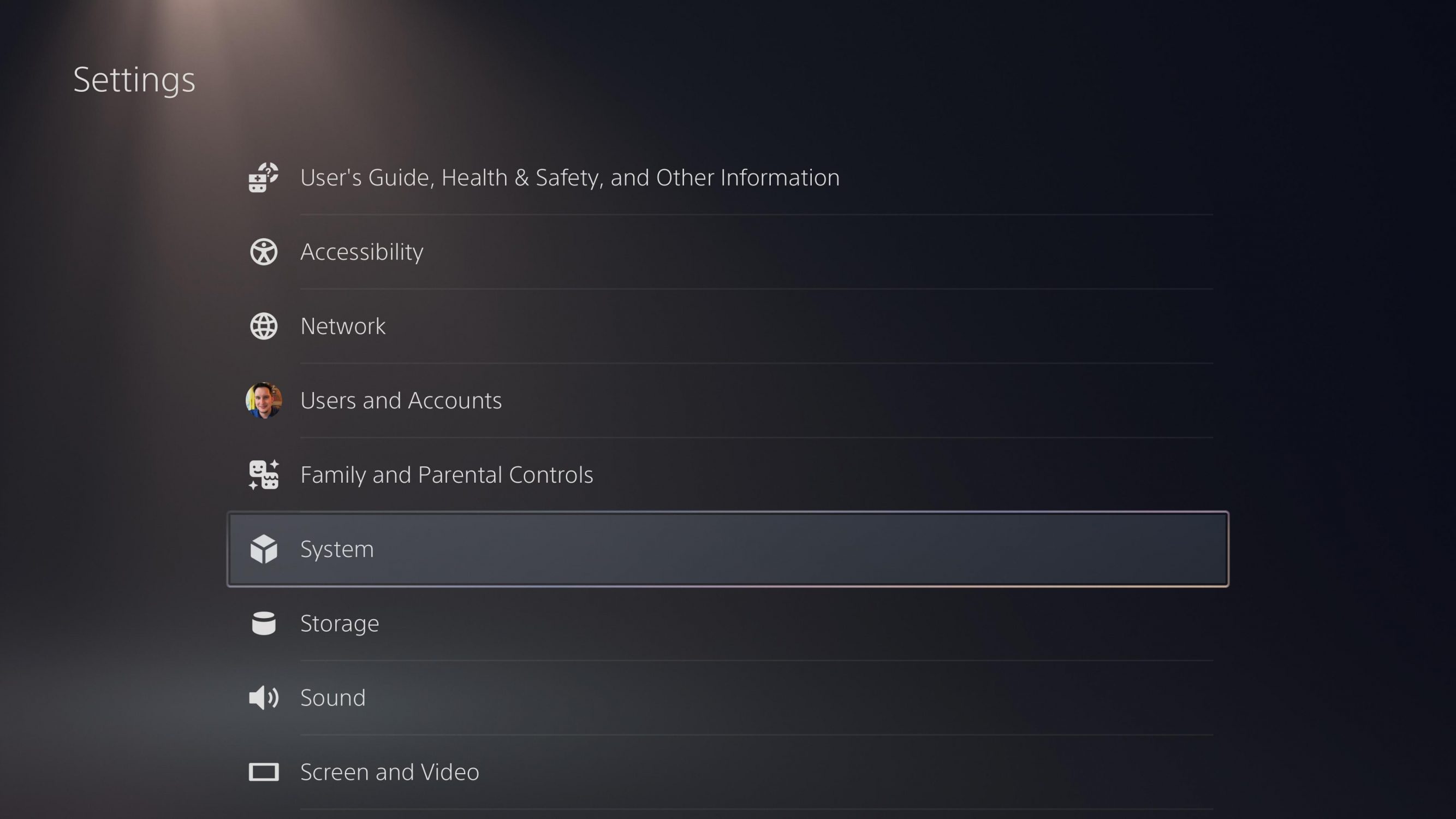
The Settings Screen
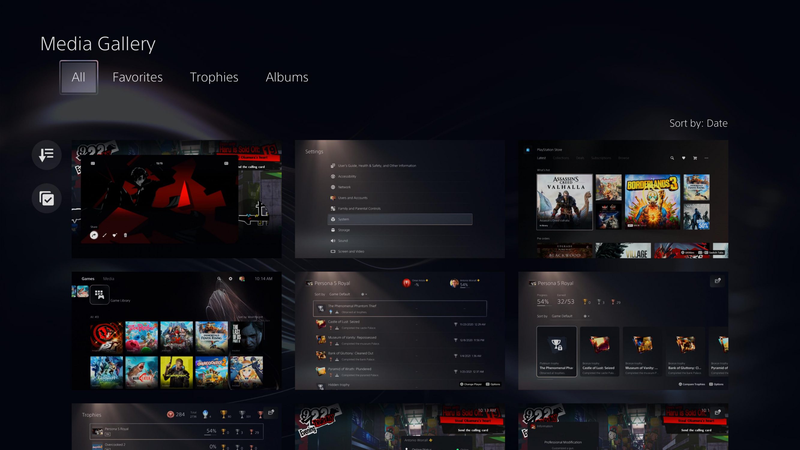
The Media Gallery
This isn’t the case on PS5. The majority of the screen changes to artwork that matches whatever game I currently have selected which means what I’m looking at varies wildly. This is admittedly a nice touch in my opinion, but the UI falls apart from there. I don’t understand why the home screen is more on the dark gray side with white elements but the settings menu is a creamy gray with white text and UI elements only to have the built in store display a black wallpaper with white text and UI elements. There’s a different background for the Game Library, App Library, Media Library, PS Store, and settings menu. I don’t understand why they don’t all share the spotlight-esque background of the settings and trophy menus. The submenus all have rounded corners, which I like, and uniformly have dark gray backgrounds with white text. This definitely sounds like nitpicking, but it leads into my main issue which is the overall user experience on PS5.
A Frustrating User Experience
Oh boy. Where do I even begin? First off, WHERE ARE FOLDERS?!?! We waited forever to get them on PS4 and they’re just missing on PS5?! My folders should simply show up with all my games in them when I connect my external HDD to do a system transfer from PS4 to PS5. Another new feature, to go along with the individual game art on the home screen ,is an option to play background music for the selected game that takes the place of the menu music. I may be in the minority here, but I enjoy the calming system music and wish I could disable game music from taking its place, but instead it’s all or nothing. If I don’t want to hear rapidly changing theme music as I tab through games I have do disable both system menu music and game music altogether which is a real shame.
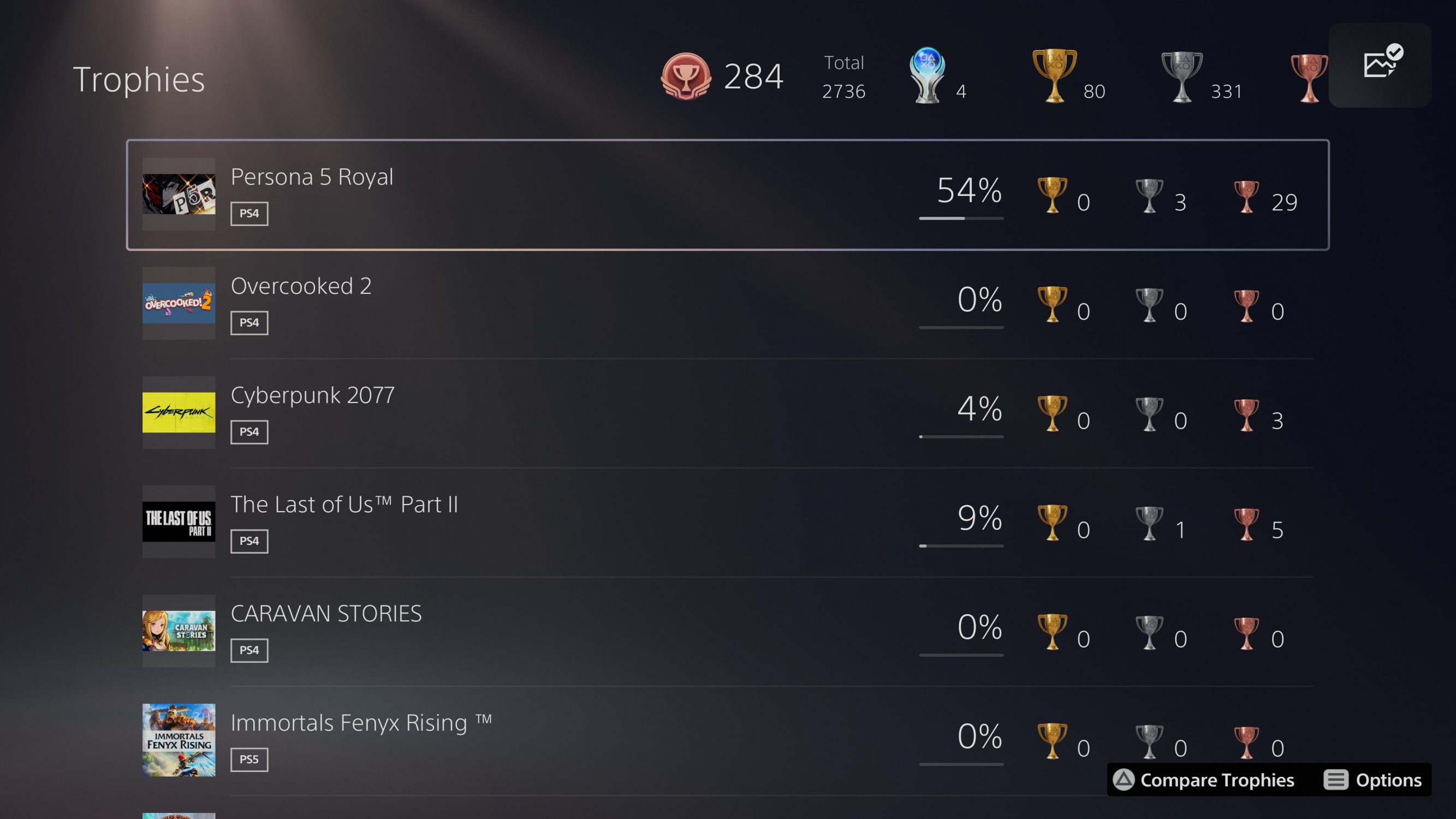
Another issue I have is that trophies feel like they’ve been put on the back burner. It was easy to get to trophies from the home screen on PS4 with a dedicated icon that took me right to a beautiful vertical list of all my games, but on PS5 I have to click on my user profile, go down to trophies, and select it which kicks me to the main trophies screen.
PS4 games show trophies as cards
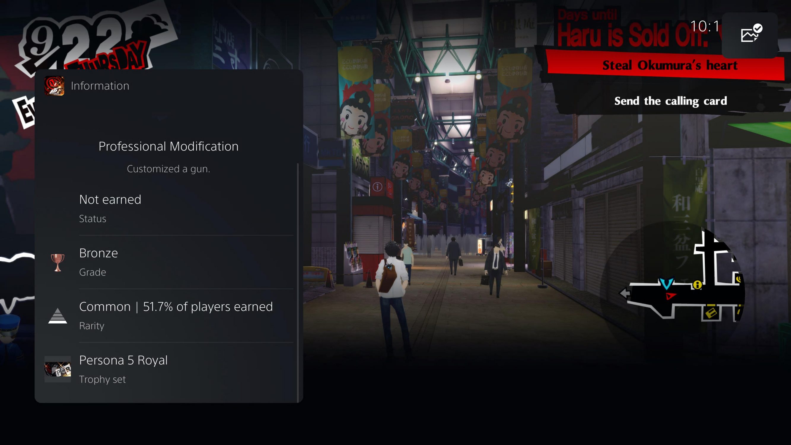
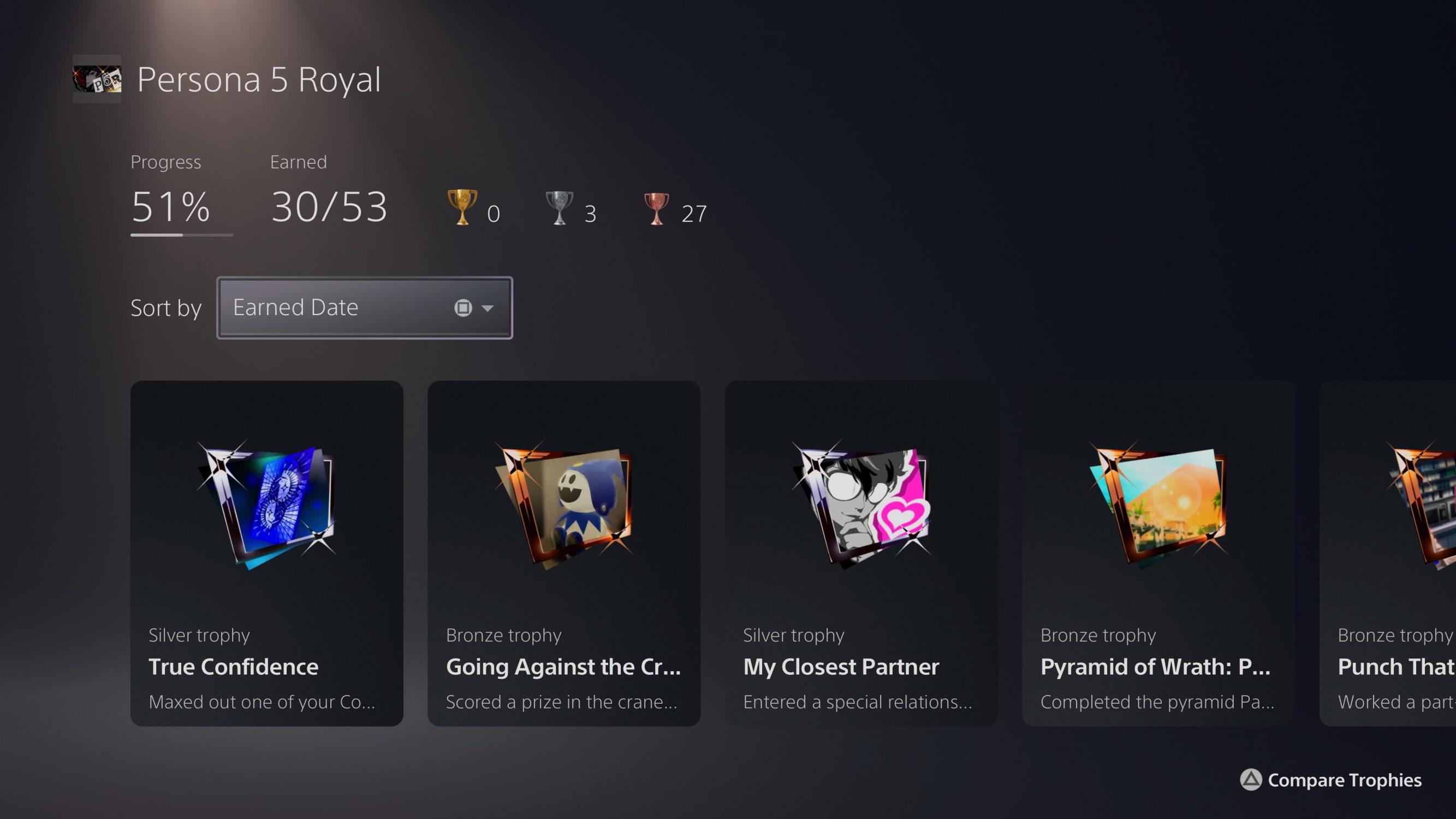
You have to click on a trophy card to see the details
Clicking on trophies from the user profile takes you here
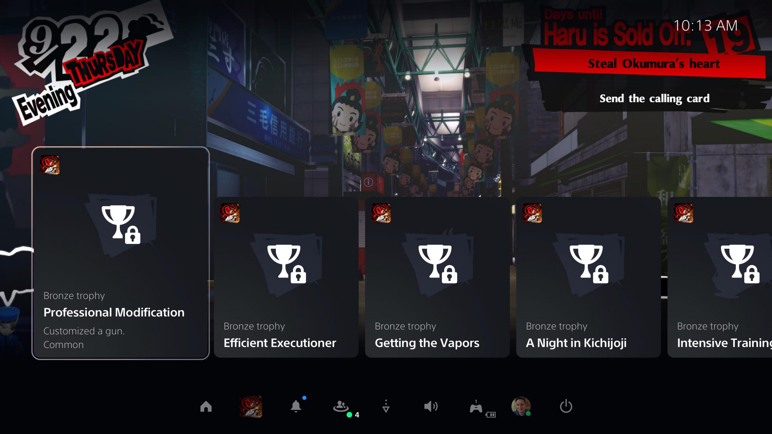
This is how each game is presented in the trophies screen
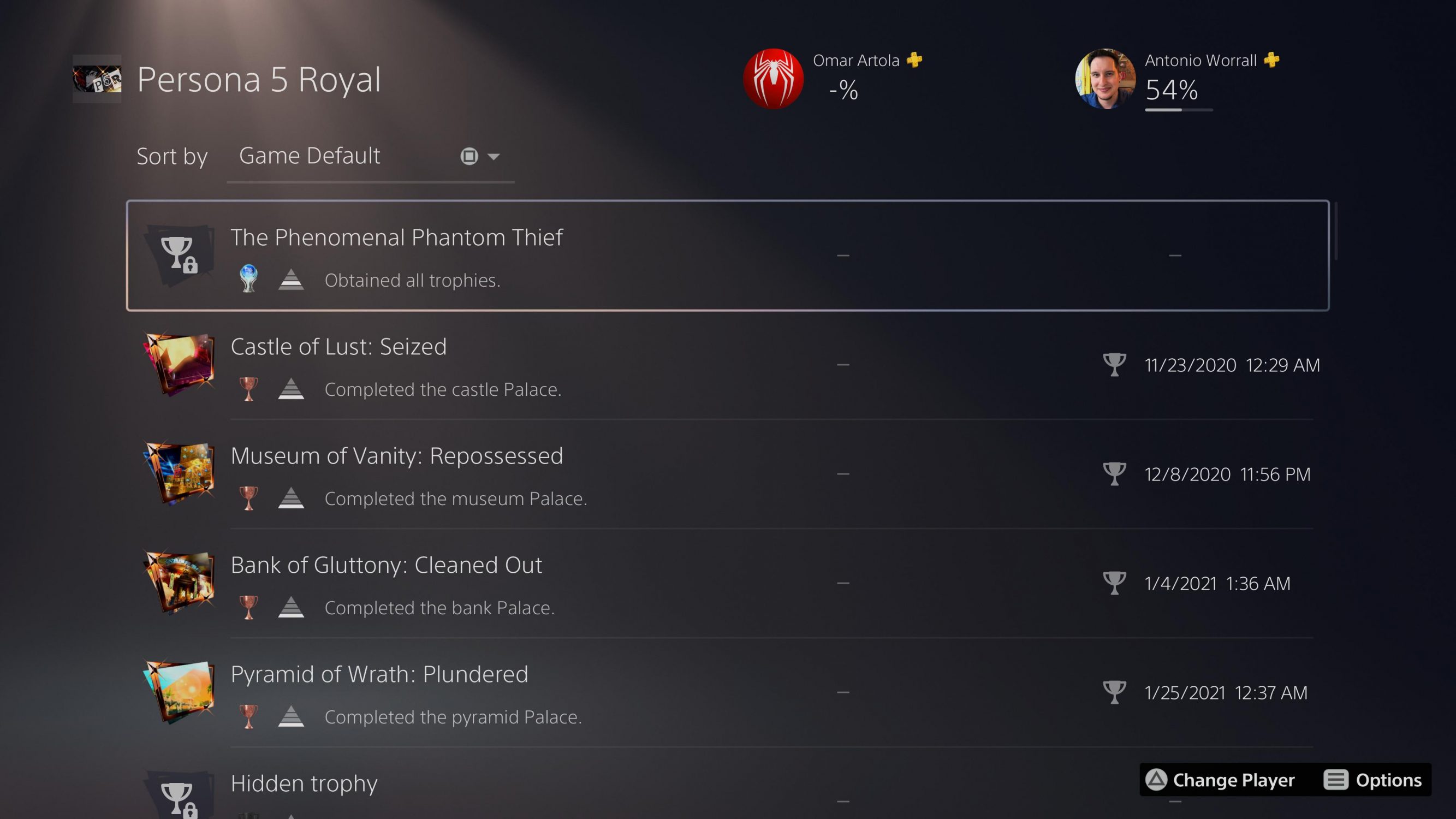
The only way to see trophies in a vertical list is to compare them with a friend
But the madness doesn’t end there. My biggest issue lies with Sony’s choice to push their new card based interface in what they’re calling Control Center. Now I don’t mind Control Center and I actually prefer it to the PS4’s quick menu overall, however, just like with the home screen, Control Center has a trophy problem. It used to be that if I was in a game I could easily see a vertical list of all the trophies for the current game I was playing in the quick menu. This was a feature I liked and one I used often. On PS5 those days are gone and instead what happens is I launch Control Center and am presented with around eight cards that cut off the name and description of the trophies. If I want to see all trophies I have to, once again, click on my profile within Control Center, navigate to trophies, and click on that. Doing this kicks me completely out of my game and into the system’s main trophy menu that displays a list of all my games—it doesn’t even take me to all the trophies for the game I’m playing and instead forces me to select it.
What the fuck kind of logic is that?
It’s completely backwards from what PS4 added with the quick menu and what Xbox has had for years. YEARS! To make matters worse, selecting a game from the main trophy menu shows game data and lists all trophies in a single horizontal strip in card form. The only way to see a vertical list of trophies like on PS4 is to select a game and compare trophies with a friend. Once I’m done viewing trophies I have to exit to the main menu and re-enter my game again since there’s no way I know of to jump right back into the game. So viewing trophies while in a game went from around two to four button presses depending on where I was in the PS4’s quick menu to around ten or so on PS5. Who thought getting kicked out of a game to a menu and then having to exit to the home screen and re-open the game again was a good UX idea? I loathe it. Oh, and why is the new sound when a trophy pops so low? The new sound effect is a bit boring but at least let me hear it. I often times miss the notification because I can’t hear it and it can only be shown in either top corner of the TV—let me see trophy notifications in the lower center of the screen like Xbox! Also, add some god damn flair to the animation instead of a boring-ass fade in and out! This is yet another area where Team Green excels.
There’s other user experience choices that baffle me as well like the lack of finding where the the Media Gallery lives. I have no idea how to get to it other than from the shortcut when trying to share a screenshot or video. It’s not in my game library (understandably) but its also not in my app library or media library. Another feature I frequently used on PS4 and still wish Xbox had was patch notes for games. I like to know what the big bug fixes and additions are without having to look it up on my phone, and with Sony trying to keep you from doing just that by adding game hints right into the PS5’s OS, I don’t understand why patch notes were removed for PS5 games. After playing on Xbox for so long I also appreciate being able to quickly navigate the guide (quick menu) with the bumper and trigger buttons and wish I could navigate the cards in Control Center with the bumpers and the bottom categories with the triggers, but that’s a minor annoyance.
There Are Great New Features
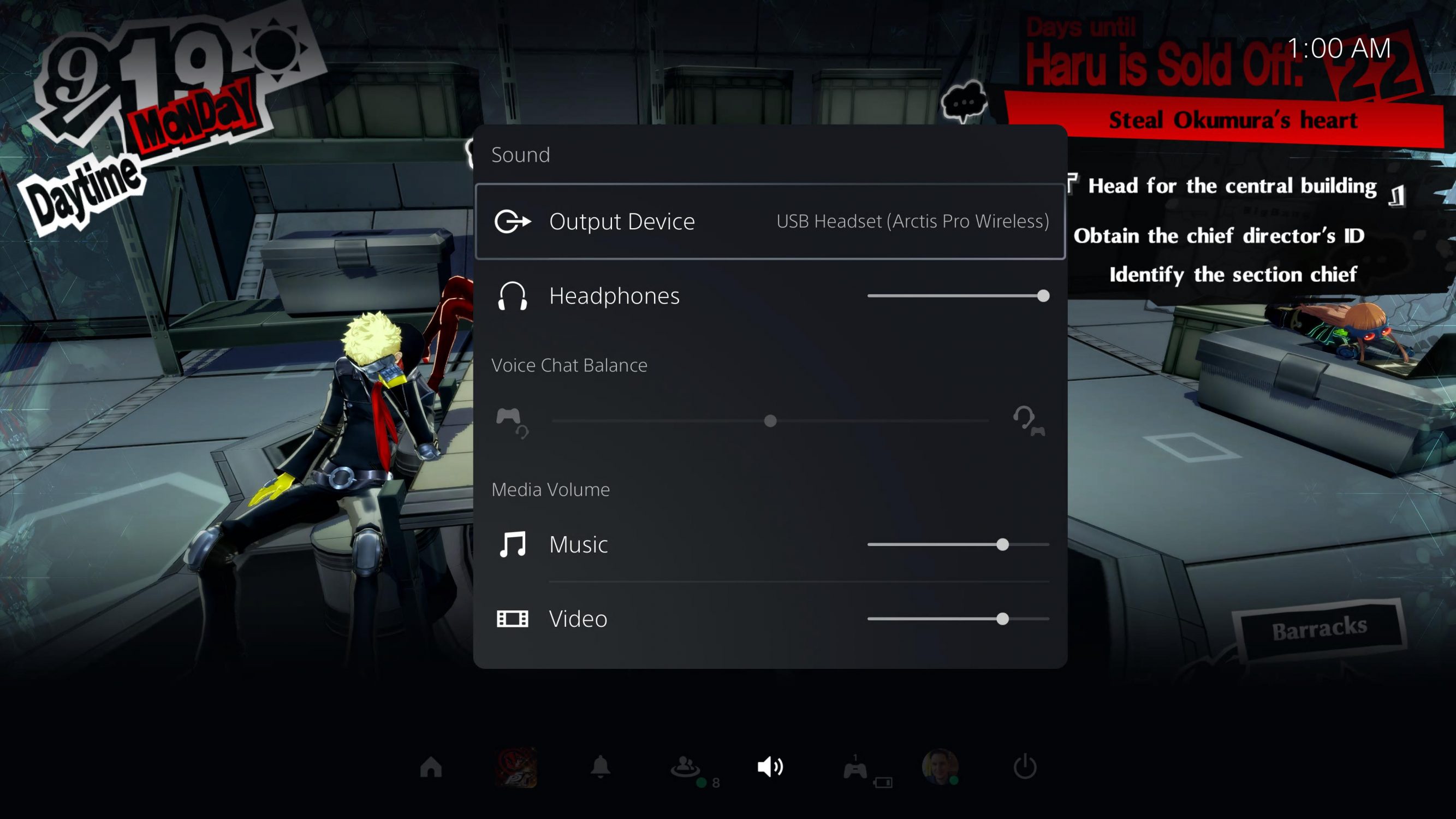
Sony just announced they sold 4.5 million PS5’s since launch, so they probably don’t give two shits about my complaints. A quick scan of Reddit shows I’m not alone though as a lot of gamers think the new UI needs a lot more work. Two of my favorite UX decisions are being able to quickly toggle between my TV and my wireless headset as an audio output from Control Center, the fact that PS5 automatically keeps my output to my wireless headset while its connected (which is all the time) so I don’t accidentally blast the apartment at night when I boot it up, and that holding down the mute button on the DualSense mutes the entire system’s audio output which is perfect for when my wife wants to tell me something.
Listen, the PS5 is a great system, but some of these decisions really get under my skin. I mean, I wrote almost 2k words about it, but at the end of the day Xbox doesn’t have the games I’ve been spending a lot of time playing lately like Persona 5 Royal or Ys IX Monstrum Nox. At least, not right now. With Microsoft’s first party acquisition spree—and especially with buying Bethesda—that might change. So at the moment, for me, PlayStation has the better game library while Xbox has the better overall experience.


